Gaining relevancy with the amateur athletic community.
As a start up in the fitness industry, TimTam had gained some traction with their recovery product line. TimTam makes professional grade therapy products for professional athletes, trainers, and therapists. However, with this mission and positioning, it left the amateur fitness enthusiast market untapped. During the initial discovery phase, TimTam presented with misdirected branding and packaging, and an internal confusion on the product line. When introducing a specialty product to an amateur athlete the set of challenges ahead is to bridge the educational curve on product understanding, and to increase the success rate of product recommendation. Let's take an at-a-glance look at the state of the TimTam brand before the work began.
- Services provided.
- Branding systems.
- Design systems.
- Digital campaigns.
- Packaging.
- Promotional products.
- Learn More

Modern recovery for all.
Beyond gaining relevancy, the product line needed to be conveyed in a clear manner to assist with the educational curve. This key factor opens the door to clear expectation of product delivery and use. With these objectives met, the TimTam brand can build trust with consumers, leading to repeat business and a referral program.
The scope of this project embodied repositioning the entire product family, gaining awareness, reinventing the category and packaging systems, and fresh marketing resources to drive traffic and awareness. With all these other factors coming together, we were able to create and release the complete Push Series category, with two new products slated for the amateur line. This Push Series category also introduced a cost-efficient acquisition strategy, that enabled consumer trial at low commitment, establishing product value and trust, leading into further sales with higher margins.
Below is an overview of the work, and how it all breaks down.
Establishing Product Clarity.
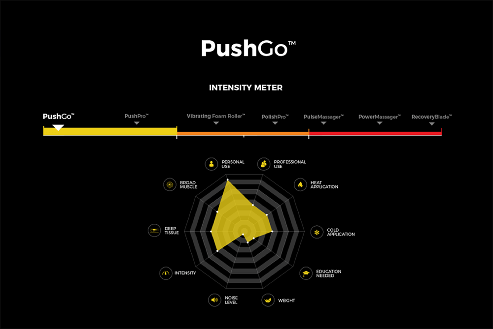
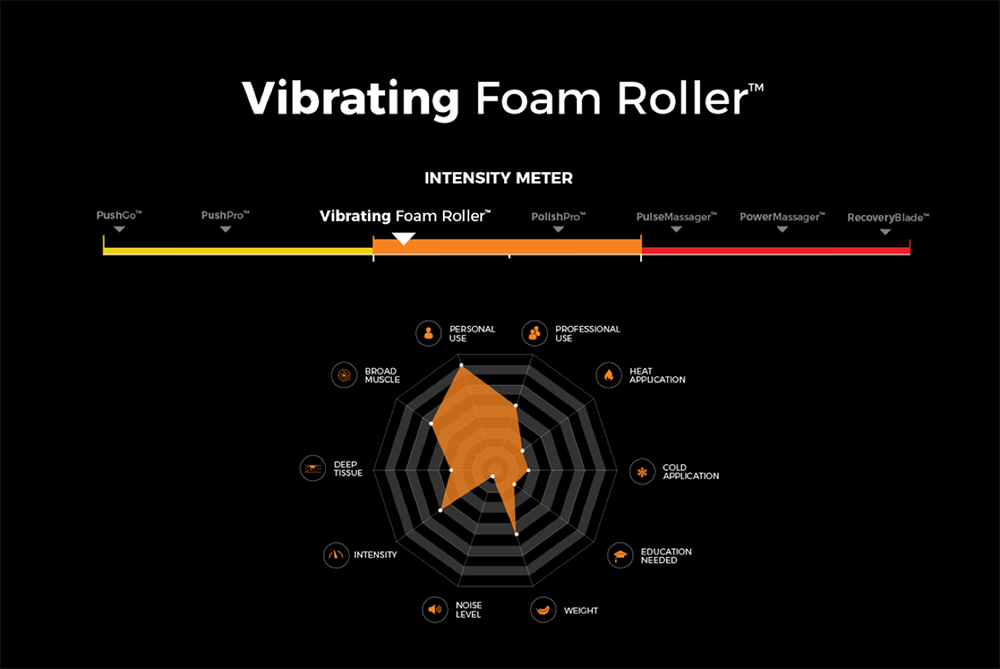
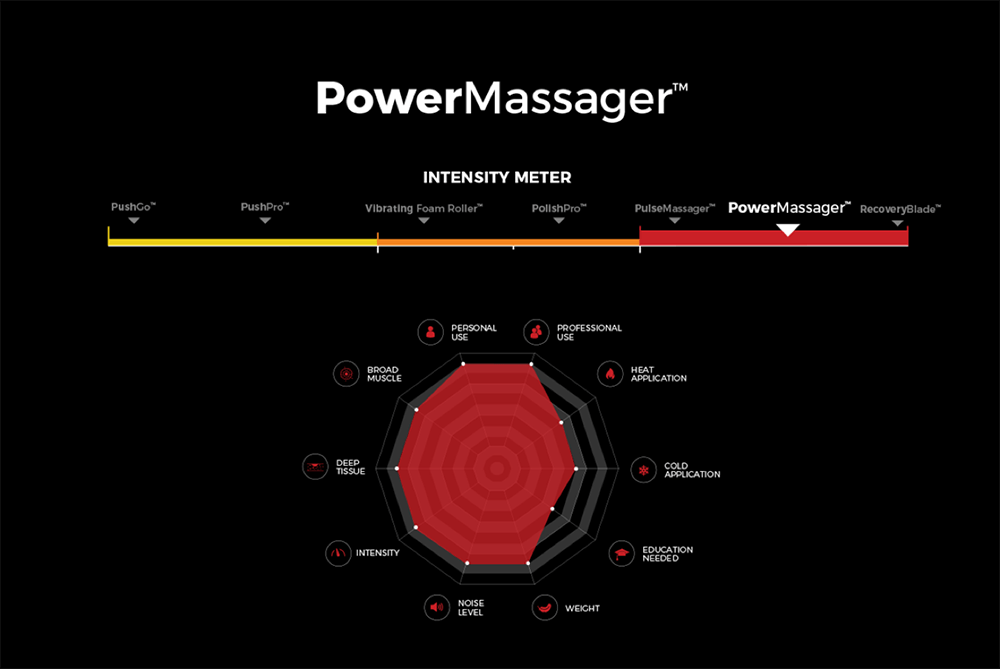
First and foremost, establishing product clarity was vital to the success of breaking into the amateur market category. By offering an Intensity Meter infographic for the TimTam product line, consumers would be able to self select the product that is most fitting to their needs. Additionally, this also led to resolving prior issues with inaccurate product recommendations based on unreliable understanding and information.
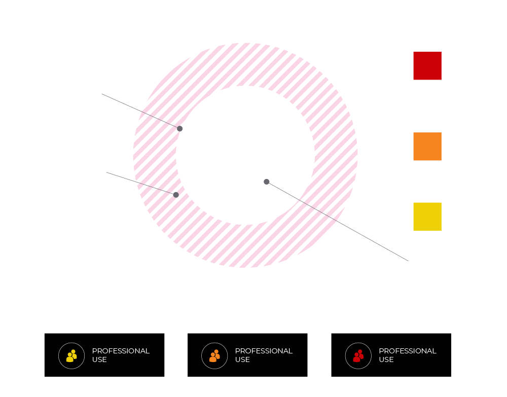
Intensity Meter – Finding the right tool for the job – bringing insight and flexibility to every athlete, for a customized modern recovery experience. These charts break down key features of the TimTam product family, and is a great system for side-by-side product comparison. The Intensity Meter covers Personal Use, Professional Use, Heat & Cold Application, Broad Muscle & Deep Tissue, Weight & Noise Level, Intensity, and Education Needed.
Intensity Meter Design Lockup – The introduction of Pantone Yellow c, and Pantone 7409 c (Orange) into the TimTam branding system was twofold. Foremost the colors were utilized as a tool for product clarity and categorization. Secondly, the colors carried consistency throughout the brand revitalization that revolved around the introduction of the Intensity Meter.
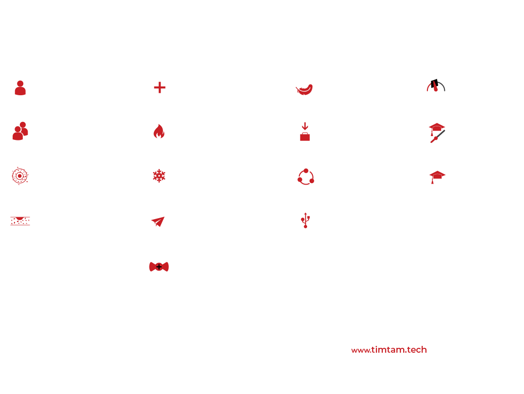
Custom Iconography.
Primary Functions.
At-a-glance Education.
Digitally Tailored.
Category Specific Sets.
Function-First Design.
A cohesive perspective that applies to all.
With a solution for product branding consistency the brand revitalization furthered the TimTam story and the product goals.
These early decisions in content strategy led to functional design elements which were the basis of the 360° branding system.
Here are some of those elements.


Enhancing product experiences.
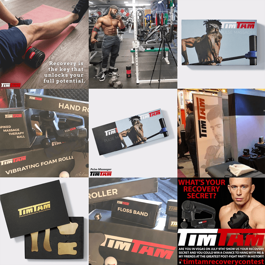
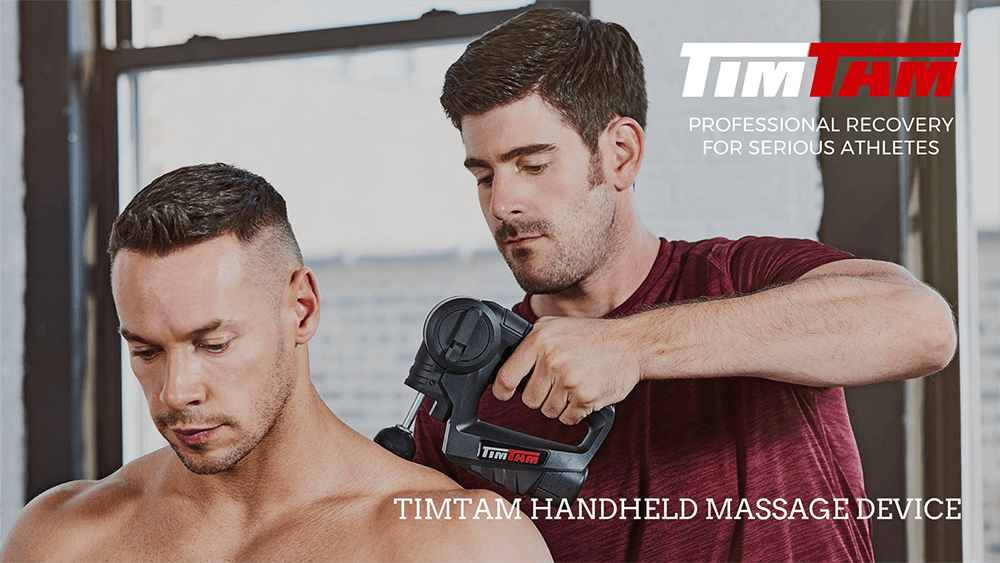
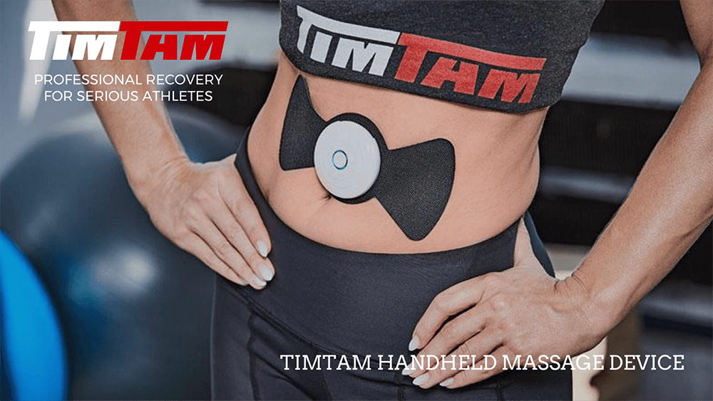
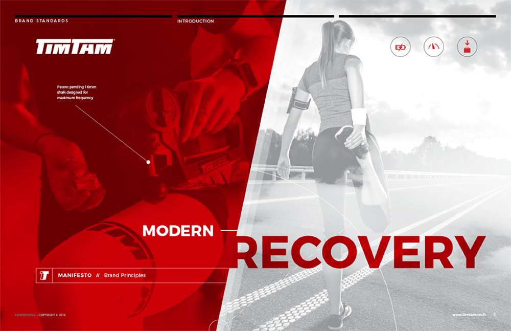
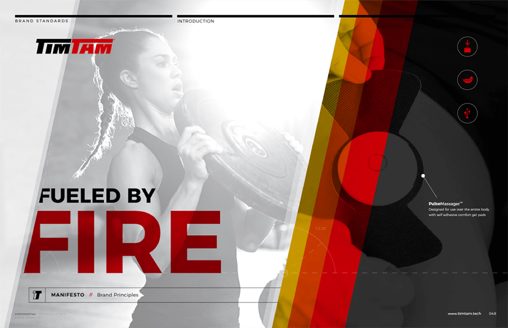
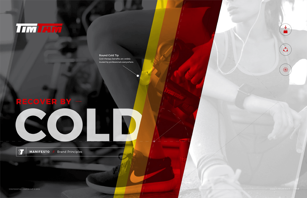
Hero Imagery & Product Image Elements – We went through the necessary steps to ensure product consistency through all platforms, covering color specifications down to numbers, defining consistent product photography angles and lighting for a cohesive presentation.
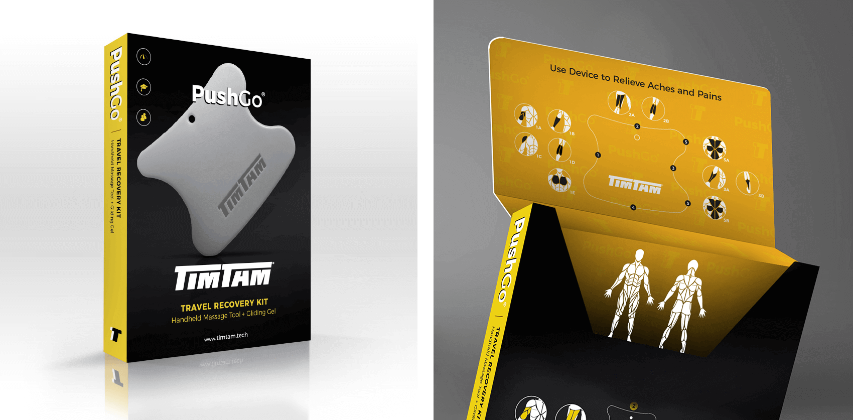
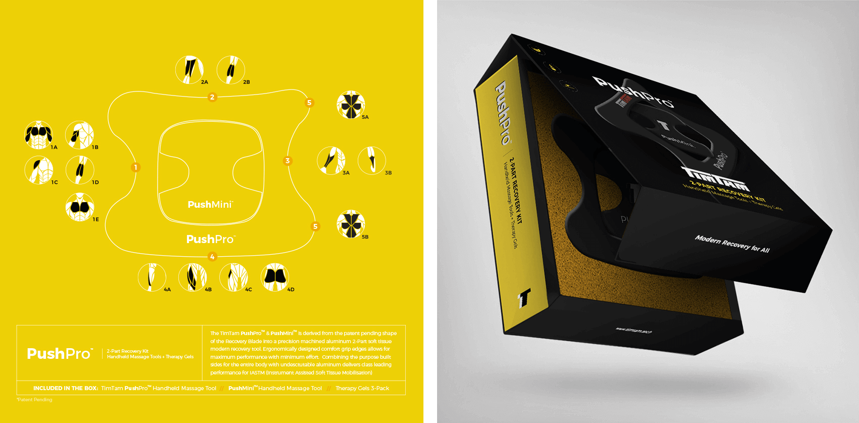
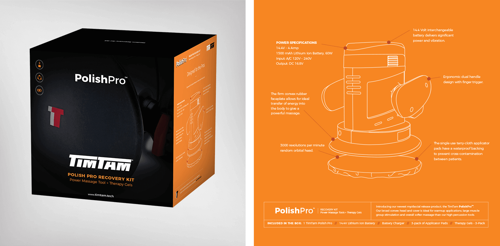
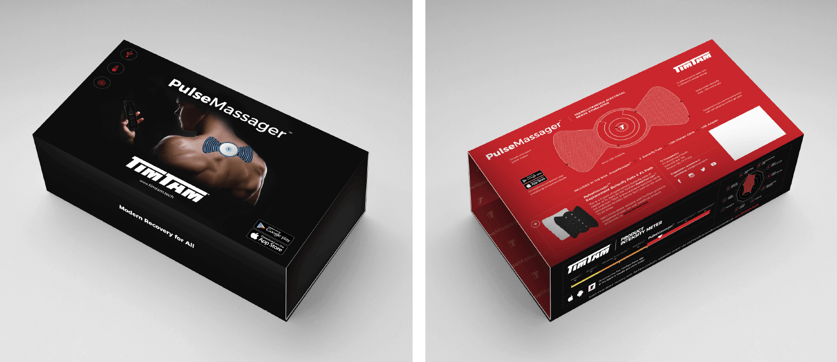
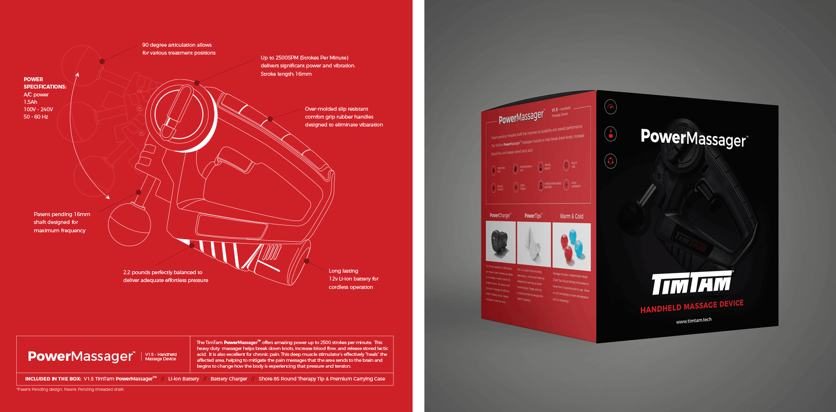
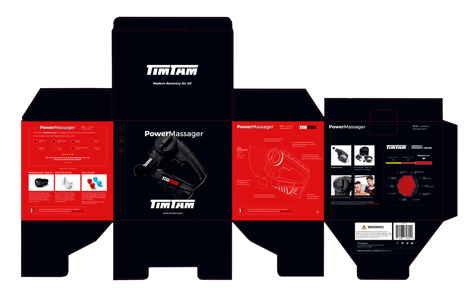
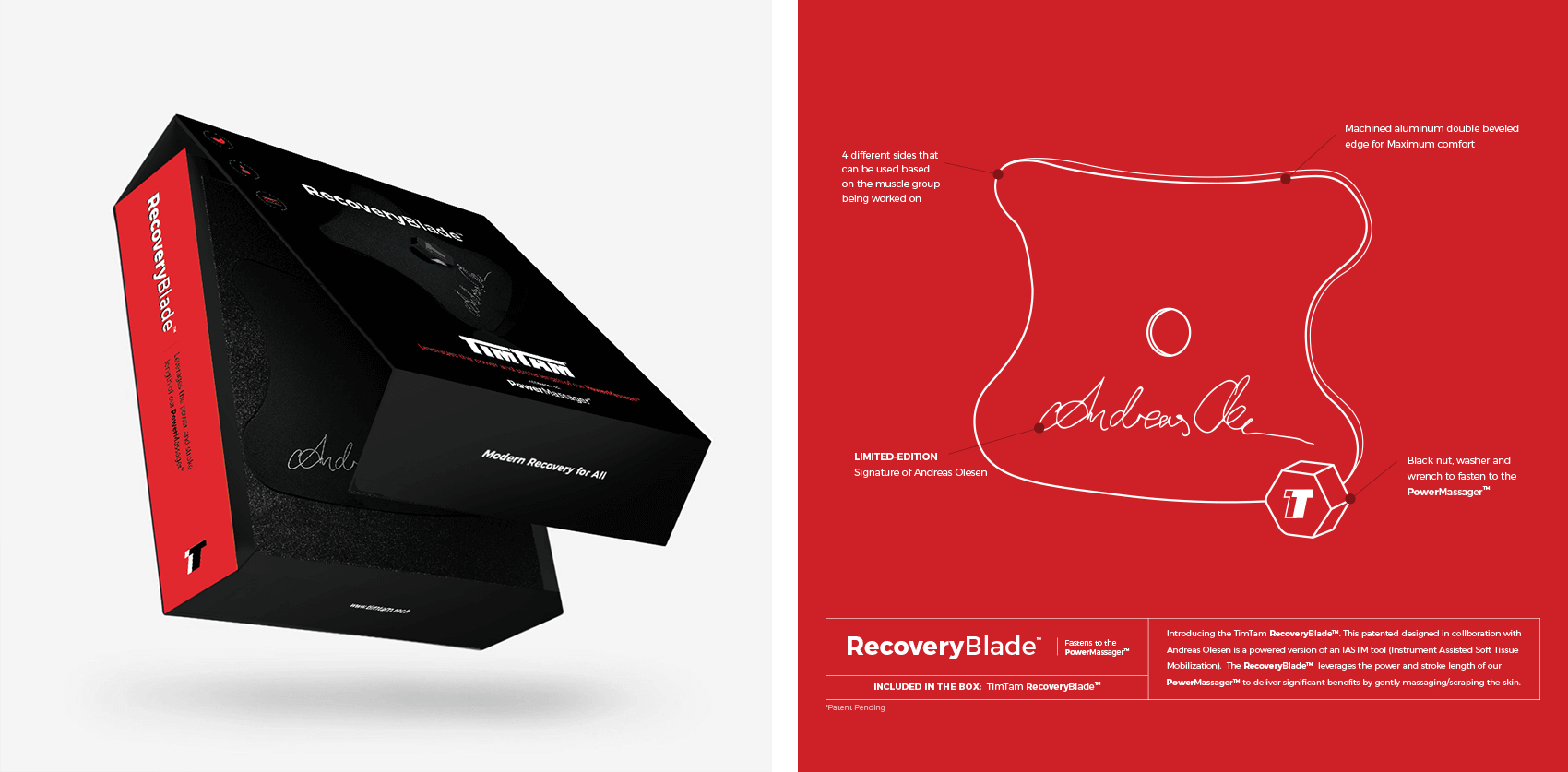
Packaging System – It is a medley of all the design elements above on the biggest stage – retail. Cohesive production techniques were applied to each products packaging solution. Key production features include: flood matte varnish, hero image ink density, Pantone color match system, and more. All fulfilled by one print vendor for a consistent global packaging solution.
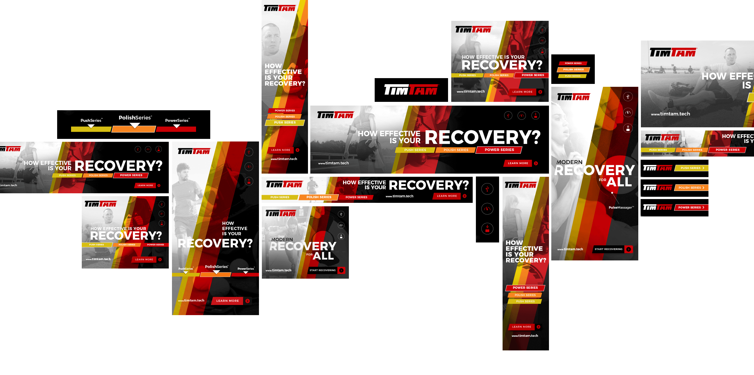
Sales Collateral – All sales sheets were revised to meet the new ‘Intensity Meter’ category based system. The system offered internal product clarity, which resulted in the right tool being recommended for the job, enhancing product experiences across the board. Digital Marketing Strategy – Delivered complete resource library for multiple Google Ads campaigns.
Pushing Category Growth.
This campaign has raised the educational aspect of recovery, pushing the room for continued category growth. This was a six-month journey introducing future innovation, and releasing a series of new products along our way. A successful POS system was built out for the Push Series, activating the acquisition strategy that was positioned in the IMG Academy and other high traffic athletic clubs. These new products captured new reoccurring revenue and built a stronger pathway for heightened product experience and referrals.
Our work encompassed content strategy and activations from concept to retail roll-out. This brand revitalization established a recognizable and reputable brand within the athletic community. It showed its success through marketing engagement and growth beyond sales performance goals. This lead to renewed contracts for future brand extensions in current development.
We want to thank my friends over at TimTam, growing together has been a highly rewarding ride.

